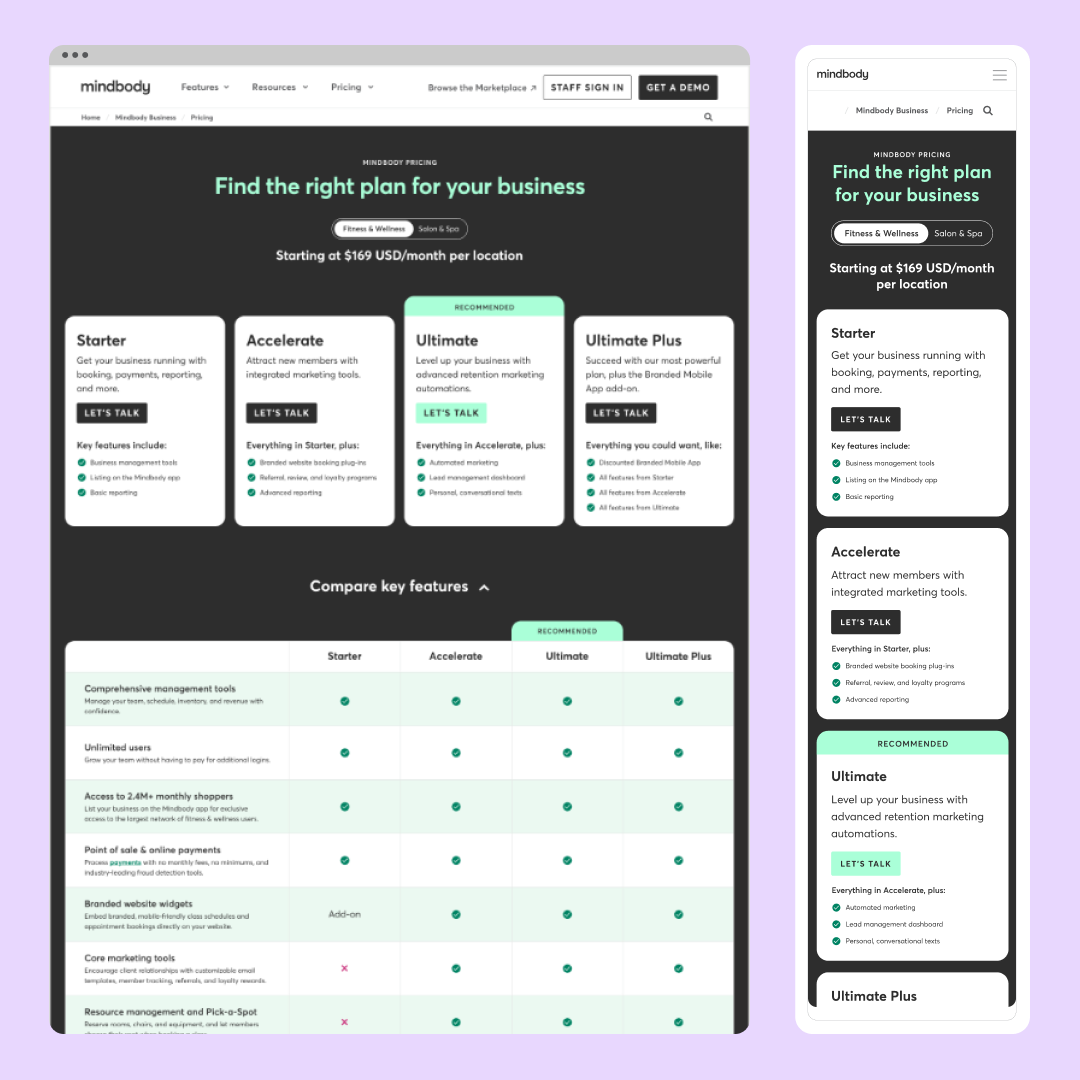
Pricing Website Redesign
Project Ask: Redesign the full webpage layout with conversion rate best practices and alignment with Mindbody’s current messaging pillars to set the web team up to iterate through experiments to optimize the page further.
Background: Mindbody’s pricing page design hadn’t been updated in 4 years. There was an opportunity to make this page more scannable, establish trust with visitors, and improve the conversion rate.
High-level Objectives: A site visitor needs to be able to:
Scan the page in <30 seconds, clearly understand the options, and find one that’s best for them
Feel a directional sense of pricing – even if it’s not explicitly listed for every package
Understand the value that they’re receiving in return (e.g., robust features, business performance, continuous innovation, etc.)
Have a sense that Mindbody will be a trusted partner
Find clear next steps (easily contact Sales or continue to learn more through product comparison)
Role: Senior Visual Designer
Software and Skills: Figma, Prototyping, After Effects, User Testing, Collaboration, Team Work
Before & After
Beginning the Process
To begin the process, we first needed to review the existing page design. The design hadn’t been updated in over 4 years and the main issues were the existing page didn’t follow pricing page best practices, the current messaging wasn’t aligned with the company’s messaging pillars, and information was presented in a confusing and overwhelming way. I worked with the Web Manager, Direction of Acquisition Marketing, and Copywriter to annotate where we wanted to change the existing page.
Initial Research & Discovery
Keeping the high level objectives in mind, we researched competitors and other best in class SaaS businesses. Throughout this research our biggest takeaways were to include value based headlines, a card layout for the pricing tiers, making sure the pricing tiers are above the fold, include information toggles, a short grid with feature comparisons, embrace social proof, and incorporate CTAs throughout the page.
Wireframes & Low Fidelity Mockups
Based on our research, I designed several wireframe options for how we could display the information throughout the page. We did three rounds of wireframing in which stakeholders left detailed feedback, before deciding to move forward with a final design. Throughout this process, I also designed new components to add to Mindbody’s website design system and worked along side the web developers to implement them on the page.
Wireframe rounds:
New components for the design system:
High Fidelity Designs
Once a wireframe was decided on, I began the process of designing high fidelity mockups. Stakeholders were interested in A/B testing two options for the hero (2 column vs 1 column). For the 2 column design they wanted an animated carousel of customer reviews. I also designed multiple layouts for leaders to choose from for the pricing tier cards, compare plans table, benefits and add-ons sections.
User Testing
We surveyed 10 anonymous people in the wellness industry and asked their feedback about the two layouts above. Based on their responses we implemented some changes for the final designs.
Final Desktop & Mobile Design
Scroll down to view videos of the designs in practice.


