Mindbody Brand Refresh
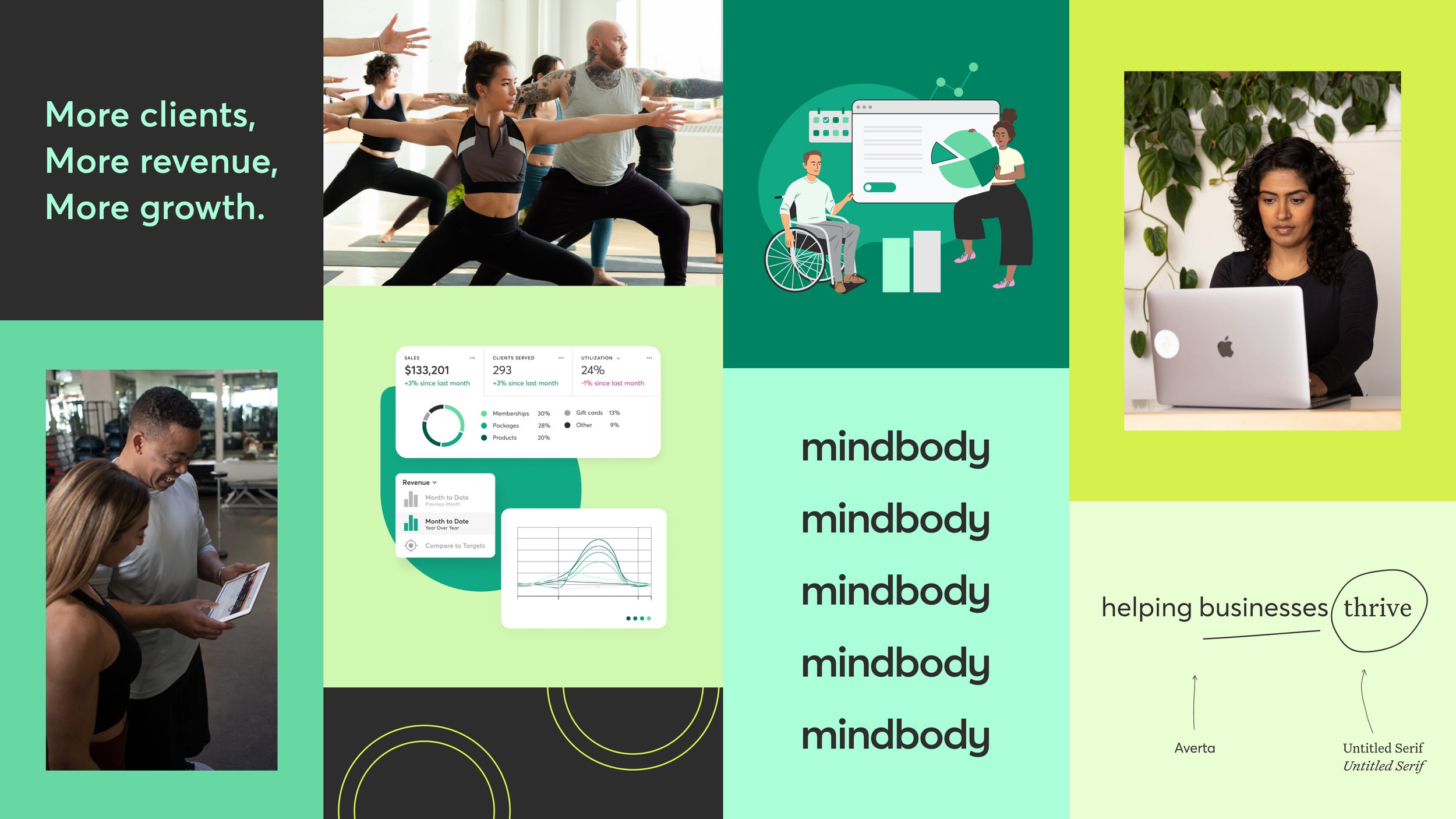
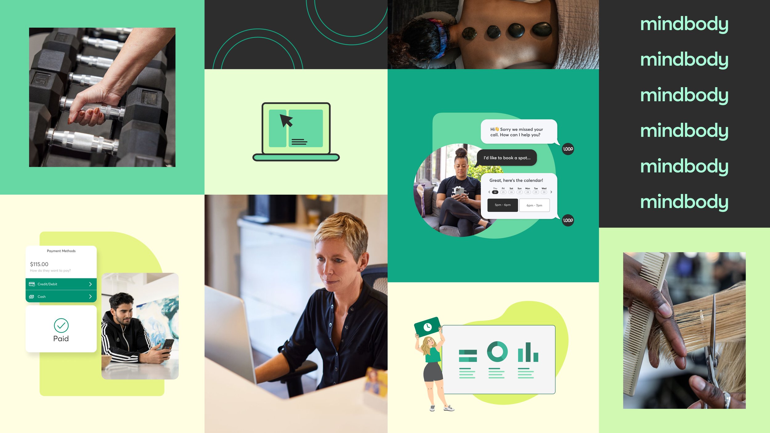
In 2023, the Mindbody creative team began the process of a brand fresh that involved updating everything from the company’s messaging and brand guidelines to a new logo and color palette. Over the course of two years we updated and redesigned every touchpoint with the goal of repositioning Mindbody as a dynamic, fun brand and modernizing their look and feel in the market.
Role: Senior Visual Designer
Software and Skills: Figma, Adobe Photoshop, Adobe After Effects, Collaboration, Team Work
Color Palette Refresh
Before
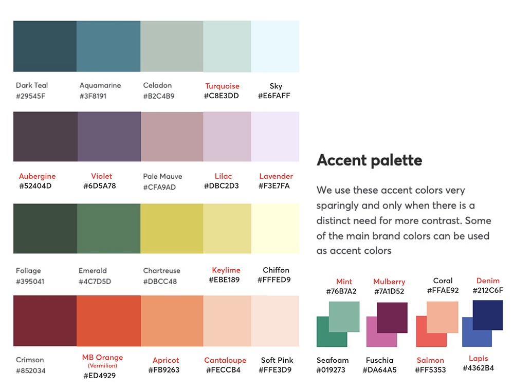
Our previous color palette takes a “paintbox” approach, with many colors used across touchpoints. There’s no singular, recognizable brand color. The palette is soft and muted—not as vibrant or modern as the company’s future plans.
The competition
Mindbody’s competitors are clustered on the two ends of the spectrum, concentrated in red/orange and in blue. Additionally, we wanted to like to occupy a distinct territory for the Mindbody brand, differentiated from ClassPass blue.
While creating the color palette with had 4 main objectives in mind:
Dedicated brand colors for brand & product use
Focus on a singular “hero palette” that can mix and match with a slightly expanded main palette. The hero colors should be included in some way with almost every expression of the brand, to drive a more recognizable, cohesive identity.Bold & expressive while staying fun & playful
Our identity needs to exude the joy of growth, vitality, and confidence in the future as we enter a new phase at Mindbody.Recognizable amongst competition
Many of our competitors occupy the same color spaces—purple, red, orange. We’re also distinct from ClassPass and the range of blues associated with the brand. Our brand must lead the space with a new, vibrant identity.Accessibility
Many color combinations have accessibility restrictions for type. As a company dedicated to inclusion, our palette must be versatile enough to meet the highest accessibility standards
The new palette: thriving & electric
Green represents vitality and growth, the heart of what we offer to our customers. These vibrant shades get an unexpected pop from a pungent neon and a playful pink. A rich, dark charcoal grounds the palette and provides the perfect canvas for a little punch.
Main Palette
Extended Palette
Logo Refresh
Before:
Standing out in market
The competitive landscape is crowded, with a few recognizable marks that hold their own. Others are complex and don’t follow best practices for brand design. Our goal was to claim a space that distinguishes us from the pack.
The problem
Mindbody’s previous logo—the ensō—is both an overused symbol for wellness and an appropriated Buddhist symbol. In order to future-proof the business, we needed to rethink how we express ourselves. The wordmark is strong and clean, but the word “Mindbody” doesn’t fit easily into every placement. We needed a stand-alone logo suitable for app icons, social media, swag, etc.
While designing the new logo with had 5 main goals to keep in mind:
Is vertical-agnostic: and representative of fitness, beauty, wellness—& beyond
Is scalable: and is recognizable from the tiniest favicon to the side of the NASDAQ building
Is relevant: and creates excitement for both B2B & B2C
Is connected: and elicits an emotional reaction on a deeper level than “just a logo”
Is unique: and feels both familiar and modern; we want it to be immediately recognizable and distinct from other popular brands
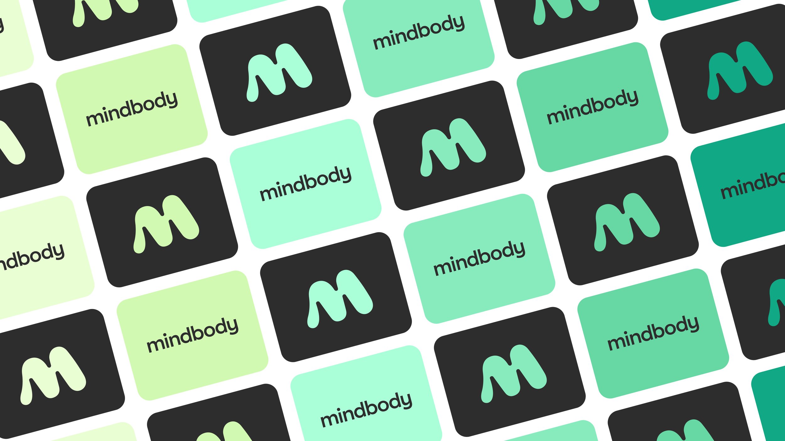
The new logo: moving with momentum
Logo Variants
Emails to announce to customers & consumers


